Case study · Otrium
Design System Creation
A shared foundation for design and development — bringing consistency to Otrium’s platform while making it easier to build, evolve and scale.
- Sector
- E-commerce
- Duration
- 10 months
- My role
- Design Manager
01
Problem definition
As Otrium grew, inconsistent design elements and the absence of standardised components created a disjointed experience and slowed development.
Different pages used different elements, creating visual misalignment and making new features costly in time and resources. We needed a design system that would unify the platform and provide a shared communication framework between designers and developers — flexible enough to evolve without compromising design quality.
02
Discovery
- Gathered insights from product managers, designers and developers to understand current challenges and future needs.
- Ran workshops with designers and developers to identify inconsistencies in component design and implementation.
- Audited the existing UI to understand where inconsistencies arose and how they affected the user experience.
- Compared other design systems to identify relevant industry best practices.
Choosing tools that teams could share
We selected Figma for collaborative design, real-time sharing and developer handoff. Zeroheight provided accessible documentation and clear component usage guidelines. Together, they made the system easier for both designers and developers to use and maintain.
03
Ideation
We established the system using Atomic Design, building from small, reusable foundations to complete pages.
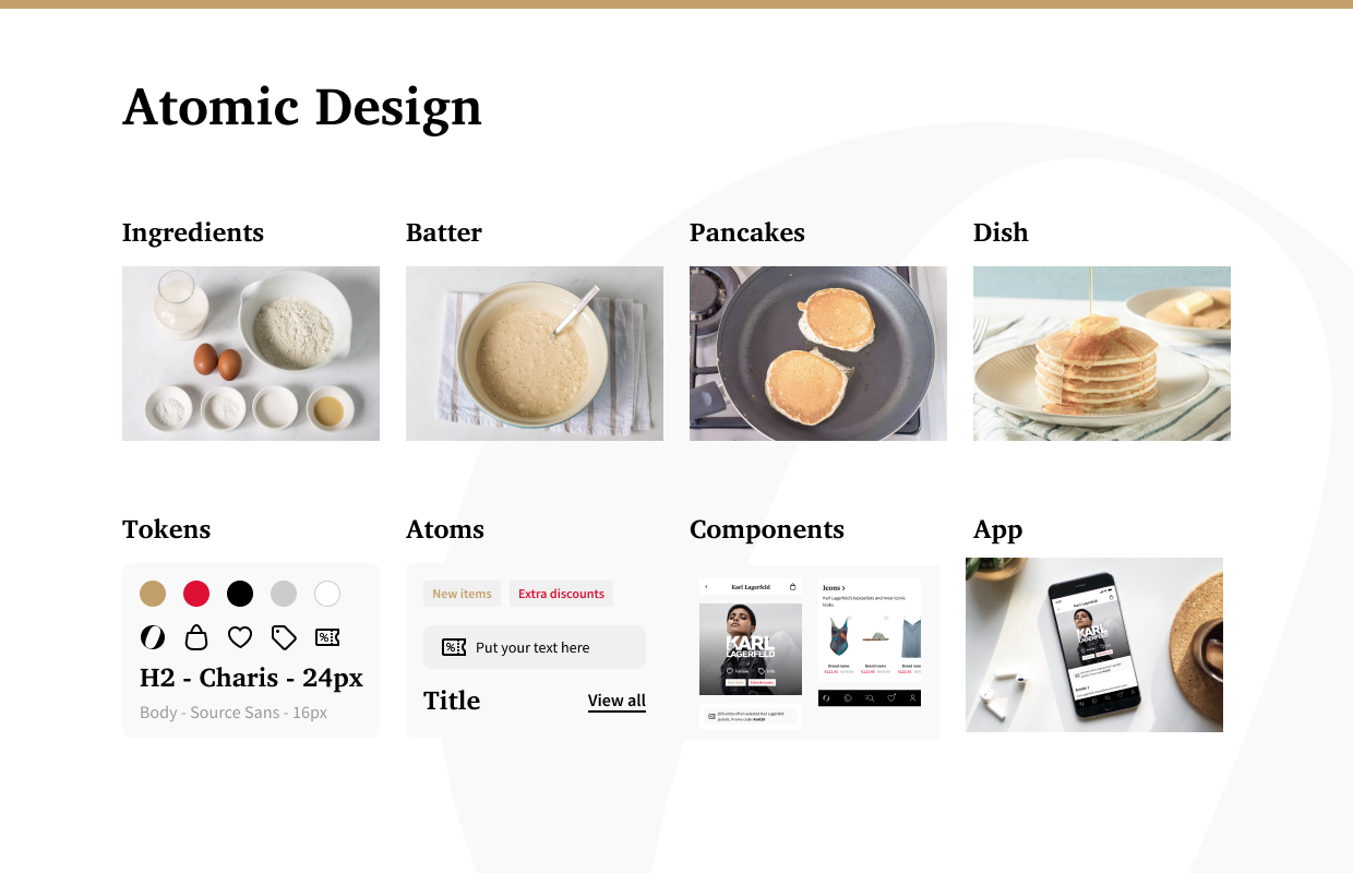
- Tokens as ingredients: colours, fonts, icons and spacing units formed the basic building blocks.
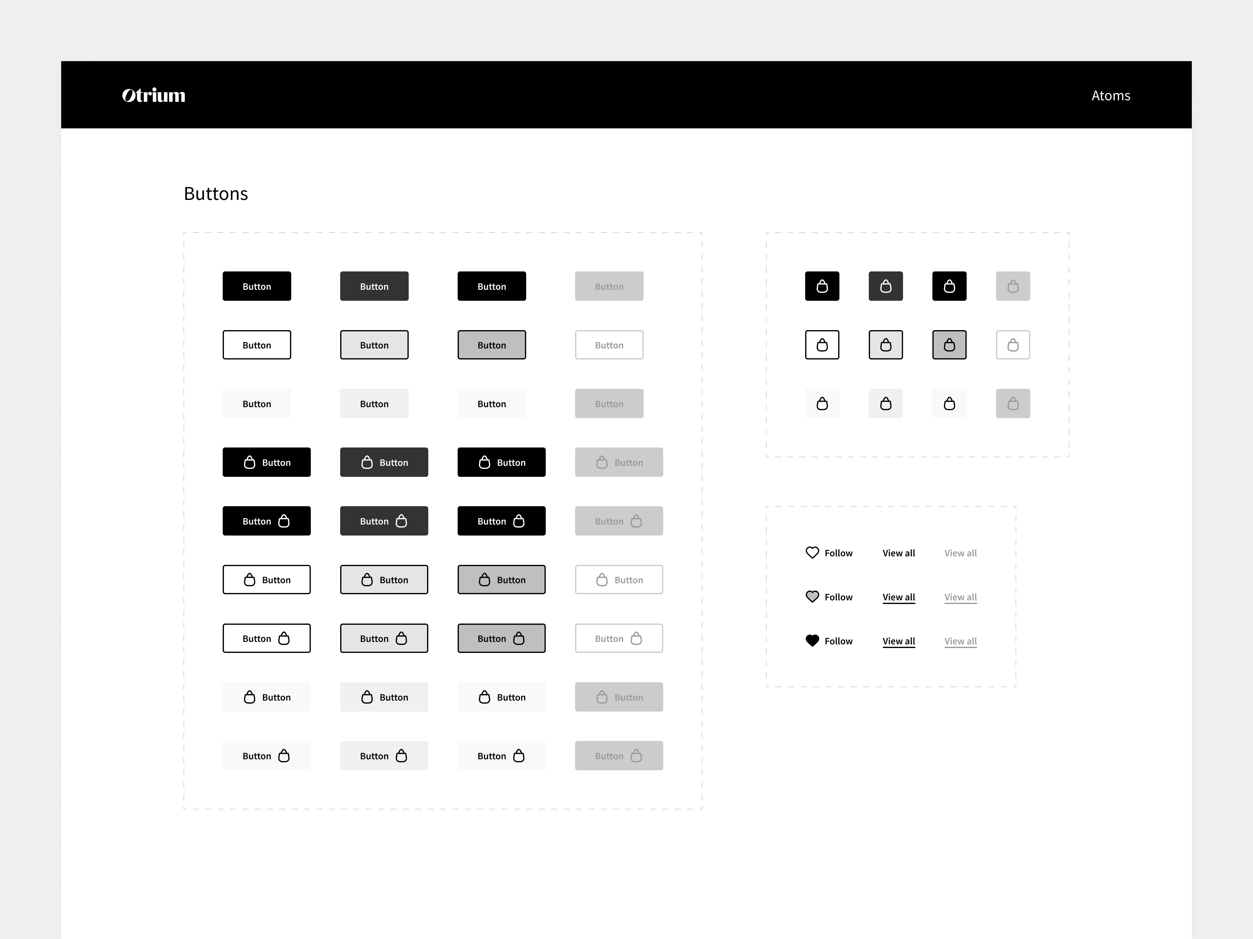
- Atoms as pancakes: buttons, input fields and containers became the fundamental UI elements.
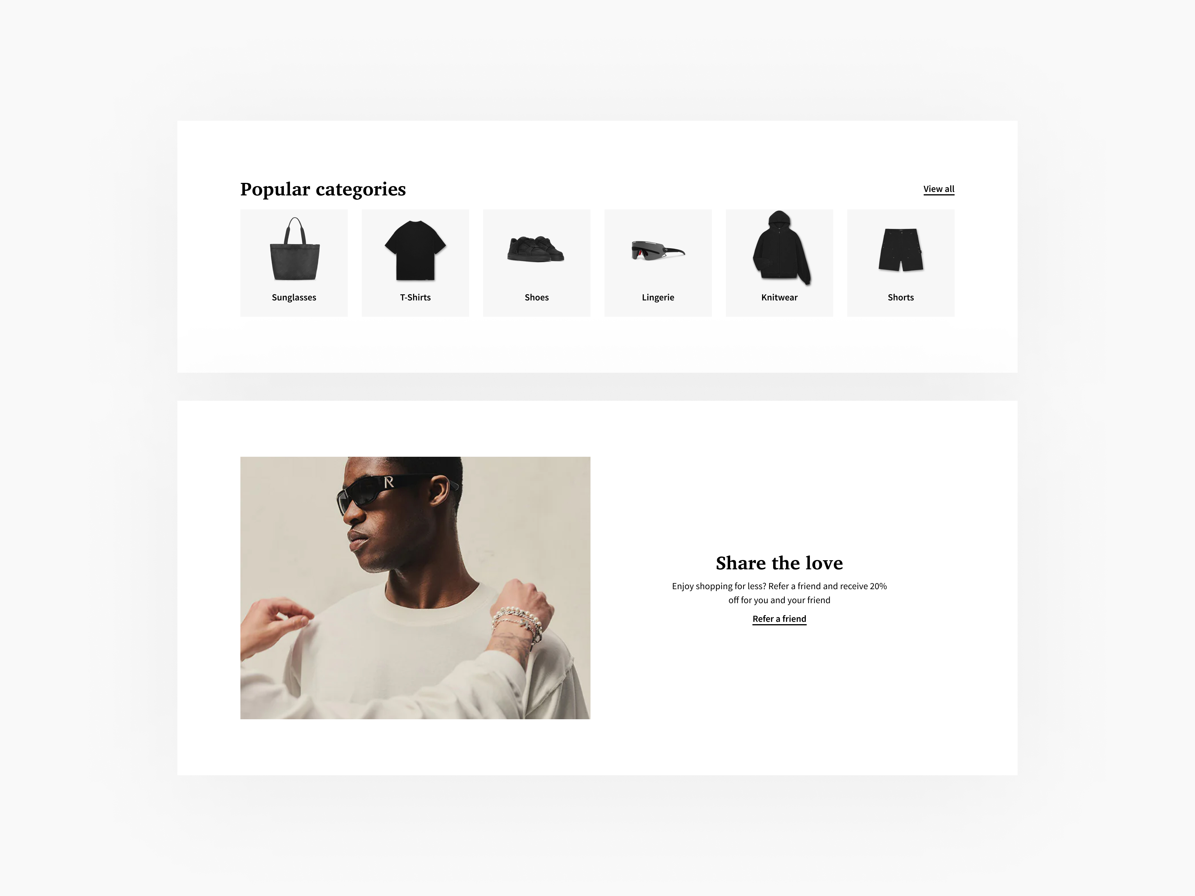
- Molecules as stacked pancakes: atoms combined into banners, cards and filters.
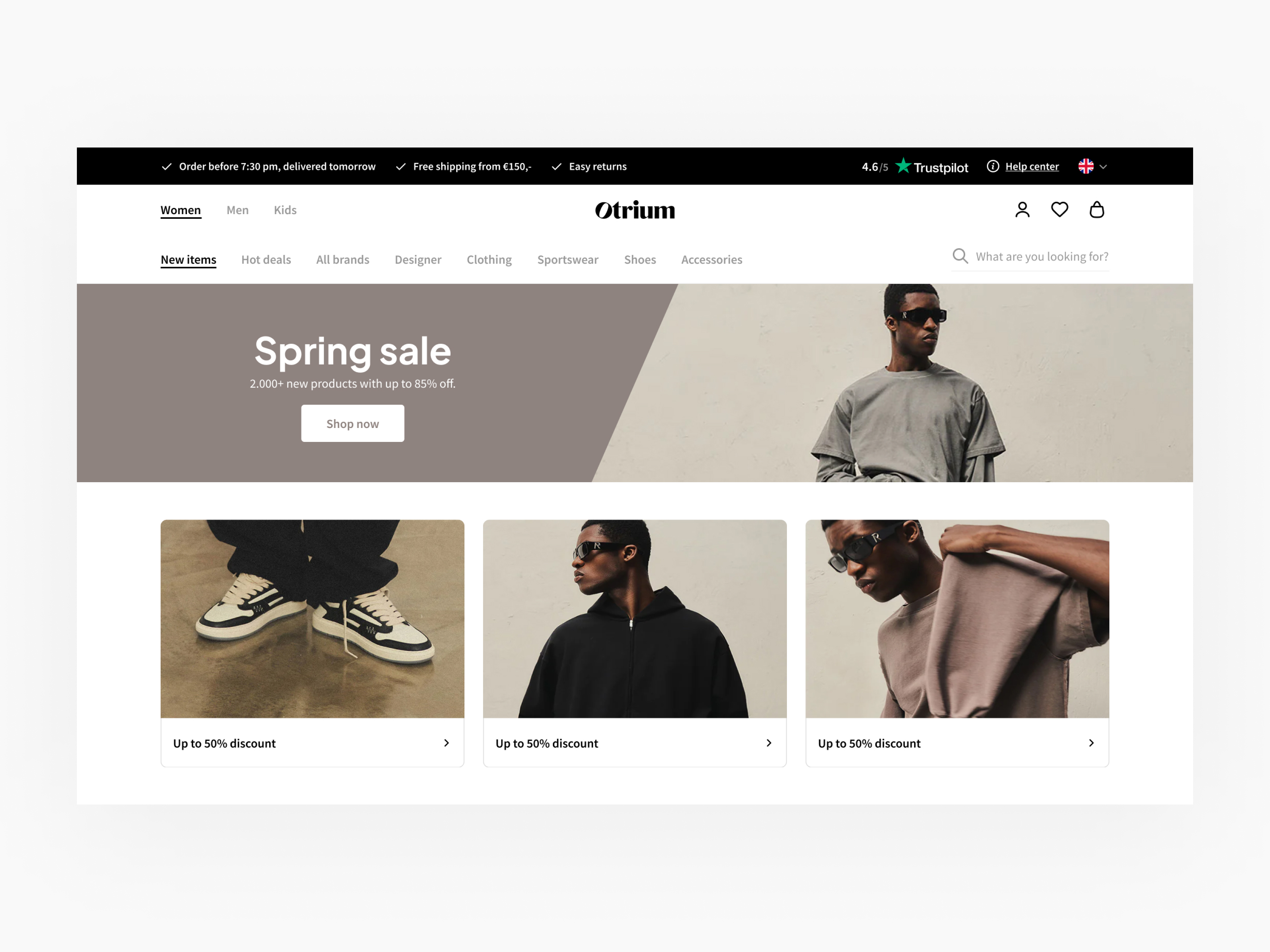
- Pages as syruped pancake stacks: molecules came together into cohesive page experiences.
Each layer needed to be modular and reusable, so updates could carry through the system without rebuilding every screen.
04
Design
Start with the foundations
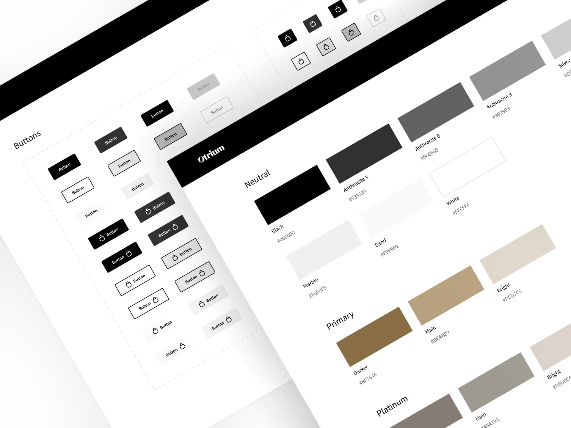
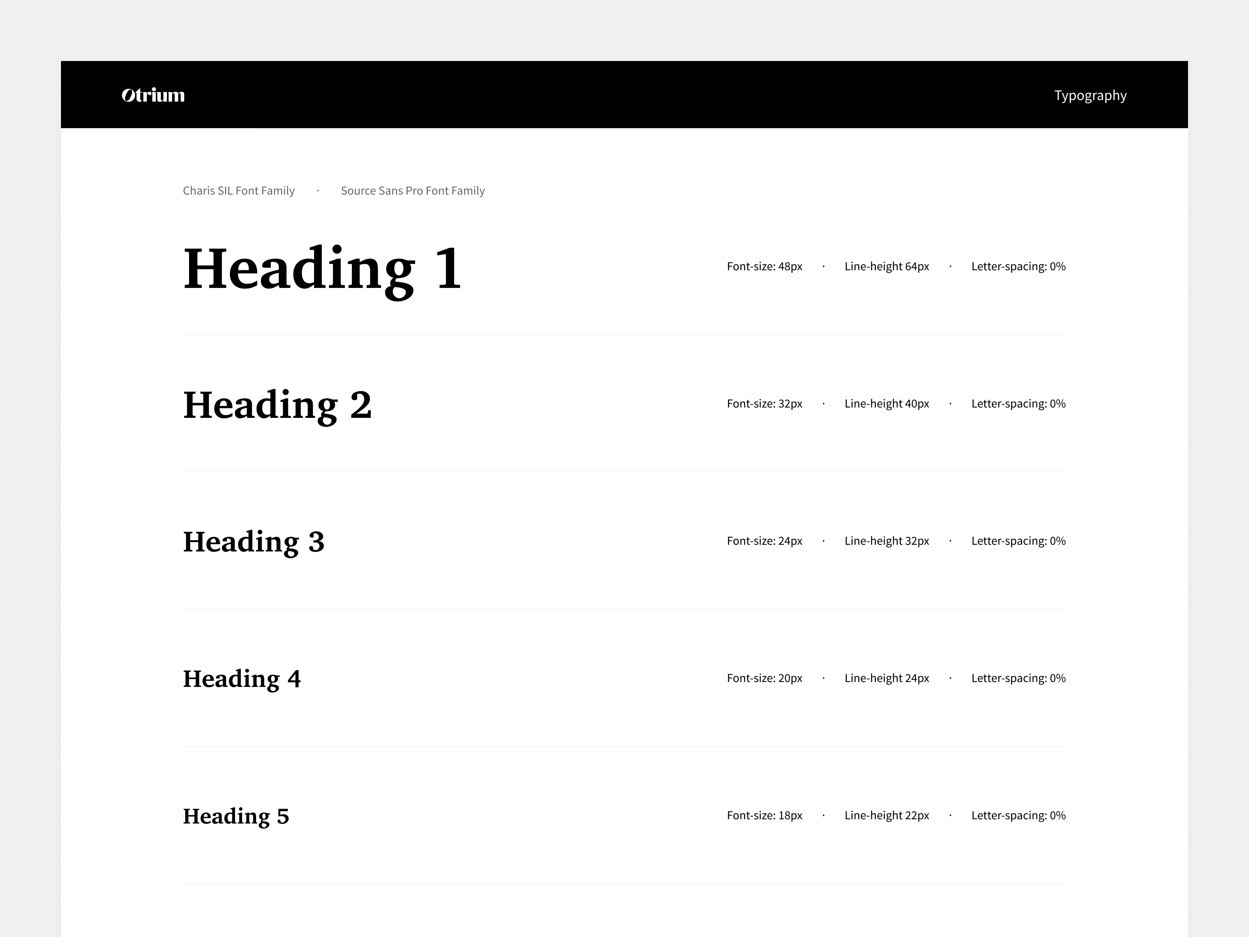
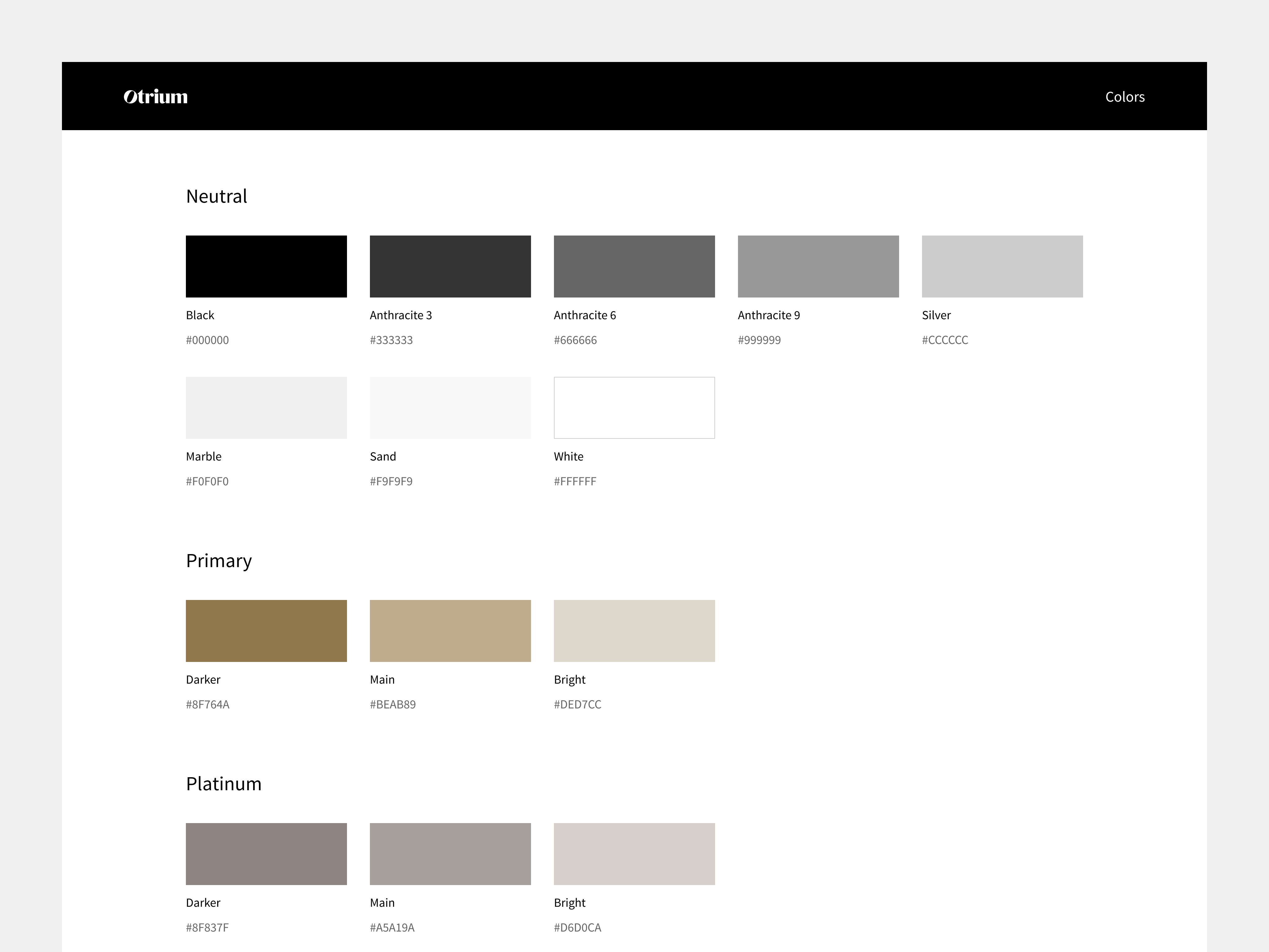
We standardised colour palettes, typography and spacing to create consistency across every design element.
Build reusable components
Buttons, icons and form elements were designed to combine flexibly without losing consistency. These atoms became more complex molecules — banners, cards and filters — that brought together functional parts of the interface.
Bring the system into real pages
We assembled molecules into key platform pages, from the homepage to product detail pages, ensuring the layers worked together across the experience.
05
Delivery
- Documented the entire system in Zeroheight, including guidelines for tokens, atoms, molecules and pages.
- Used Figma to support real-time collaboration and handoff. I worked closely with development to keep implementation consistent across the platform.
- Rolled out the system incrementally through small, fast releases, monitoring performance as it evolved.
- Conducted usability testing after each release to gather feedback and make adjustments.
06
Outcome
A consistent platform experience and a shared source of truth for designers and developers — with 30% faster time-to-market and less friction between teams.
- Consistency and efficiency: unified the platform’s look and feel, improved design quality and streamlined development.
- Scalability: made it easier to add new features and pages without breaking design consistency.
- Faster time-to-market: reduced design–development friction and shortened the time needed to release new features.
07
Learnings
- Translate research into actionable decisions. Starting with tokens provided a strong foundation for larger components.
- Balance different teams’ needs while keeping the end user in mind. A flexible, bottom-up approach worked better than a rigid, top-down system.
- Simplify and customise. Modular, reusable components made the platform easier to maintain and adapt as needs evolved.
- Choose tools that support adoption. Figma and Zeroheight helped teams understand the system and kept collaboration efficient and transparent.
More of the work
Back to selected work