Case study · Otrium
Brand page redesign
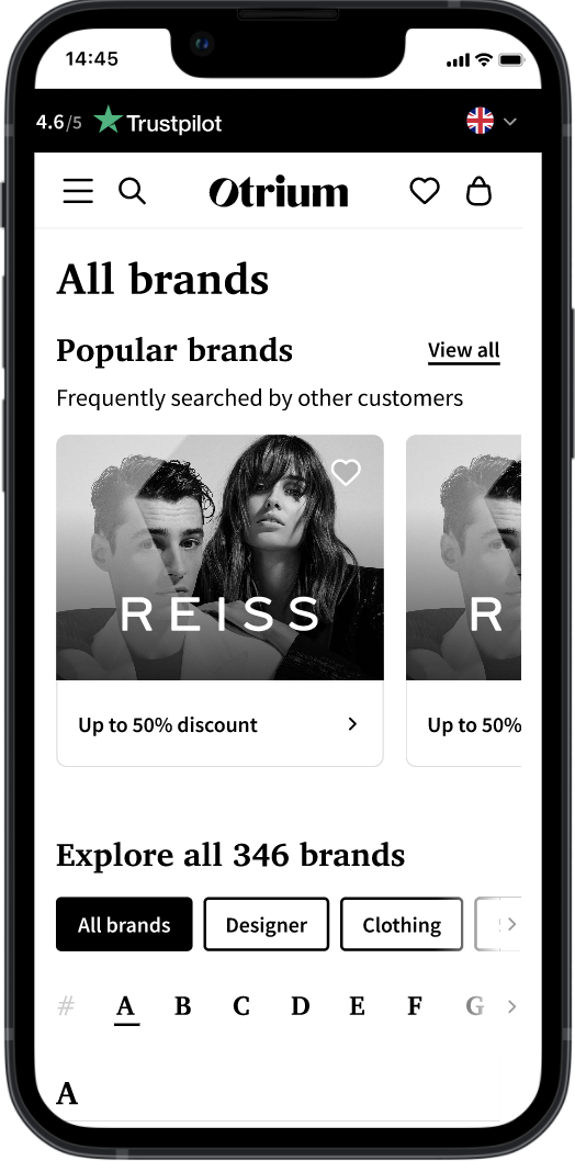
Research showed more than half of Otrium's customers shop by brand rather than by product type. The challenge: make ~400 brands easy to navigate and discover.
- Sector
- E-commerce
- Duration
- 3 months
- My role
- Lead Researcher & Designer
01
Research
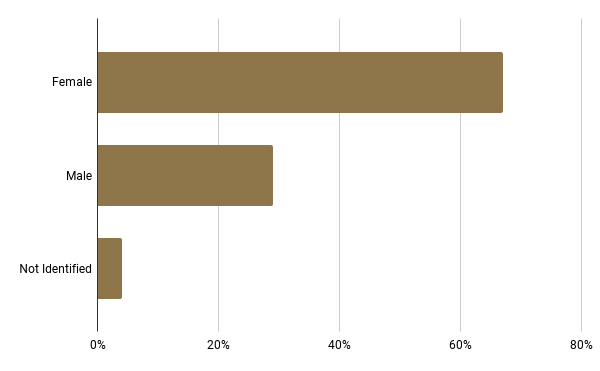
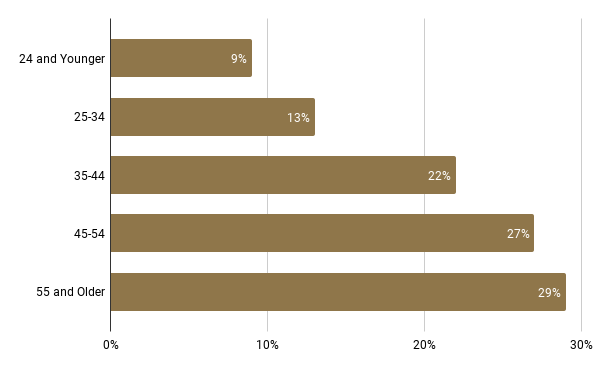
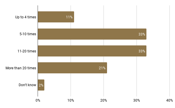
A study of Otrium's buying customers and their shopping behaviour, giving the company insight to serve different customer groups better.
Methodology & sample
- Online quantitative survey: 55 questions, designed for a 10-minute completion time.
- Target group: Dutch Otrium members who had made a purchase. A random 17% of them were invited.
- 1,524 completed responses — a maximum margin of error of 2.5% at 95% confidence.
- Fieldwork ran from 6 to 24 October 2021. With limited reference data, no claims were made about representativeness for the wider customer base.
Customer profile
Three customer segments
Bargain Hunters
- Prioritise price over brand and choose clothing on affordability.
- Value free returns; place less value on brand names.
Fashion Enthusiasts
- See themselves as fashion-conscious and express identity through clothes.
- Buy from well-known brands and keep a small set of favourites.
Sustainable Shoppers
- Care strongly about sustainable materials and brands.
- Tend to avoid fast delivery and free returns — they don't fit their values.
02
Problem definition
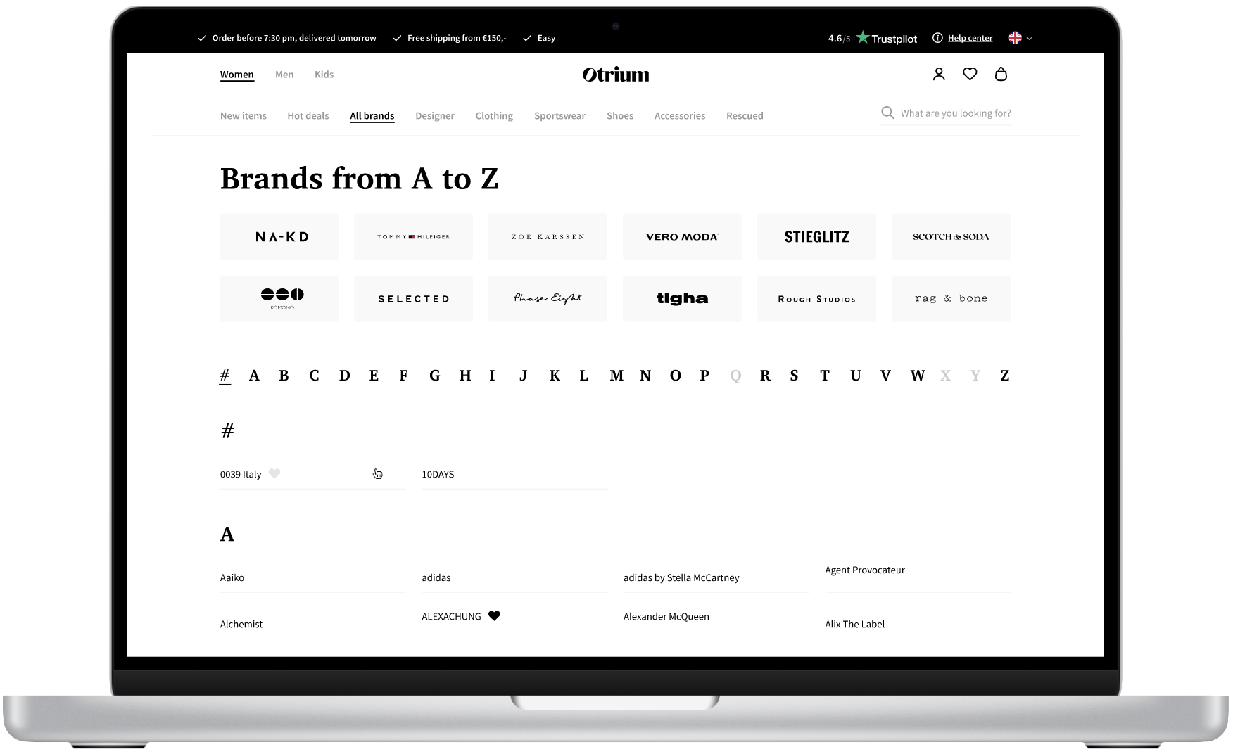
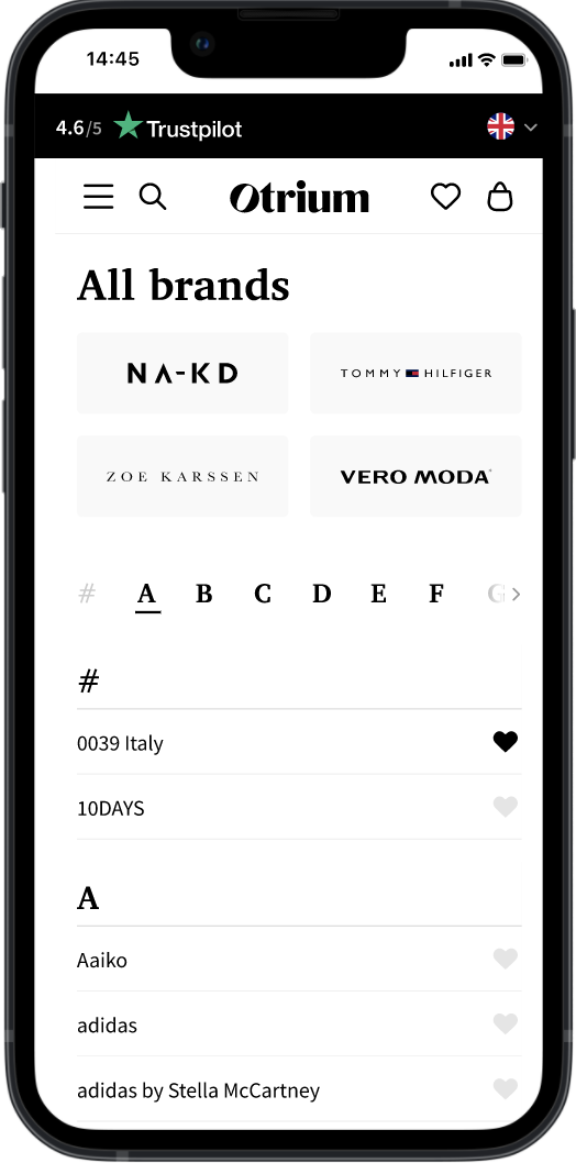
More than half of customers prefer to shop by brand rather than by category like jeans or shirts — yet the platform made brands hard to navigate and explore.
The result was a weaker shopping experience, lower engagement and lost brand-specific sales. We redesigned the brand page to streamline navigation and improve discoverability for brand-driven shoppers.
03
Ideation
- Tailoring to segments: distinct brand pathways for Bargain Hunters, Fashion Enthusiasts and Sustainable Shoppers.
- Brand visibility: top brands shown prominently, with filters to reach favourites quickly.
- Sustainability features: clear indicators for sustainable brands and eco-friendly ranges.
- Designer labels: highlighting premium and well-known designer brands for Fashion Enthusiasts.
- Expanded filters: with ~400 brands, filters for footwear, sportswear, accessories and more.
- Personalised recommendations: brand suggestions based on past purchases and shopping patterns.
04
Design
Design decisions came straight from the ideation insights, balancing user needs with business goals.
Brand filters for discoverability
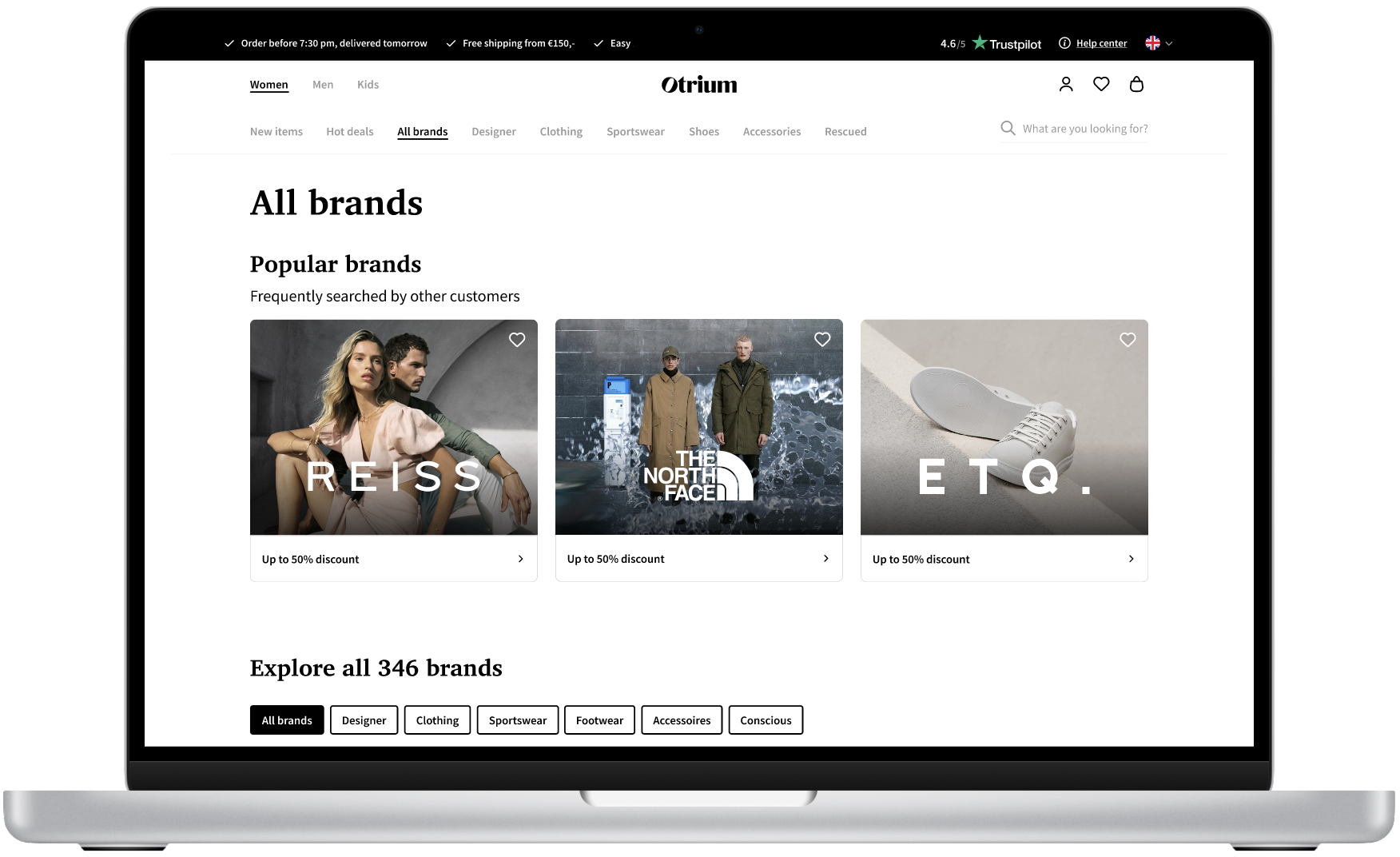
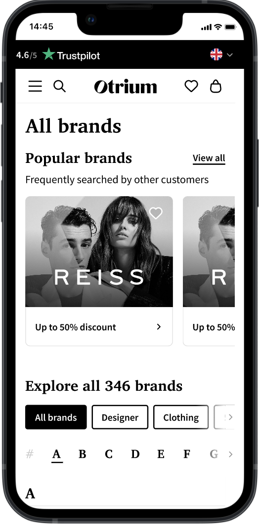
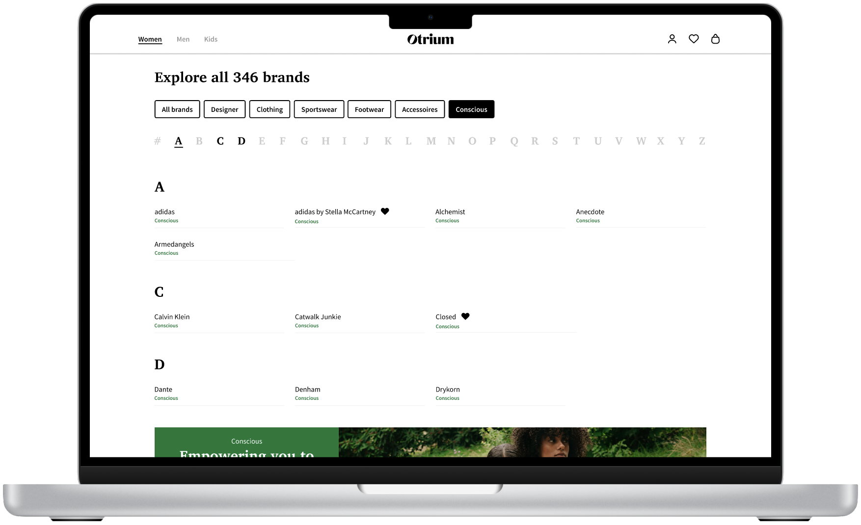
Filters by product type (footwear, accessories…) and by brand values — Conscious for sustainable brands, Designer for high-end ones — so people can find brands that fit both their needs and their values.
Featured brand exposure
Dedicated spaces for featured brands met contractual commitments to key partners, without breaking the flow of the page.
Designer and Conscious labels
Labels that visually set apart premium and sustainable brands, giving fashion-focused and eco-conscious shoppers instant clarity.
Mobile first
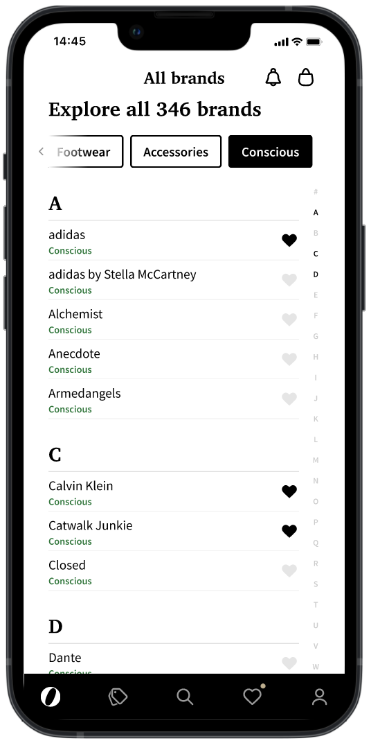
Around 85% of customers shop on mobile web, apps or tablets, so filters and brand navigation were designed to work first on small screens.
From ideation to design
- Filters were designed from research showing a strong preference for filtering by brand type and product category.
- The page was optimised for mobile around the three personas, keeping filters and brand navigation easy to reach on small screens.
- The "Designer" label was placed prominently for Fashion Enthusiasts; the "Conscious" label served eco-conscious shoppers.
05
Delivery
- Documented design specifications — layout, filters and labelling — for a smooth handoff aligned with business goals.
- Worked closely with developers on implementation, especially mobile optimisation.
- Design reviews during development to check quality and that filters and labels worked intuitively on every platform.
- Launched the redesign and monitored engagement to confirm gains in navigation, ease of use and brand visibility.
06
Outcome
- Increased brand engagement: more interaction with brand filters and higher visibility for premium and sustainable brands.
- Better mobile experience: a 20% increase in mobile session duration and lower bounce rates.
- A streamlined journey: "Designer" and "Conscious" labels helped each segment find brands that fit them.
- Higher sales conversion, particularly in premium and sustainable categories, driven by better discovery.
- Positive feedback from users and stakeholders on the simplicity and effectiveness of the new page.
07
Learnings
- Translating research into design: close analysis of behaviour turned directly into filters by product type, designer labels and sustainable practices.
- One solution, many groups: simplifying and customising search and filters gave each segment a tailored experience without overwhelming anyone.
- Bottom-up, not top-down: filters built from how people actually shop, rather than asking them to adapt to preset categories.
- Personal growth: the value of continuous iteration and of turning complex user needs into straightforward solutions with stakeholders.
More of the work
Back to selected work