Case study
Interactive fraud analysis tool
An interactive visualisation tool that let investigators uncover fraud on screen instead of on paper — moving a pen-and-paper process onto a digital platform they actually wanted to use.
- Sector
- Finance
- Duration
- 6 months
- My role
- UX Researcher & Designer
This project is highly confidential and classified. Client details are omitted and parts of the tool's functionality are obscured, so the work shown here is not the full fidelity of the final design.
01
Problem definition
The pen-and-paper process investigators used to uncover fraud was slow and inefficient, and made connections between data points genuinely hard to see.
They needed a digital, interactive visualisation tool that let them hold the big picture while zooming into a single data point for detail — quickly identifying and saving critical connections, and returning to past investigations without reconstructing them from scratch. The other half of the problem was adoption: moving investigators onto a new platform smoothly, with training that made the transition feel like an upgrade rather than an imposition.
02
Discovery
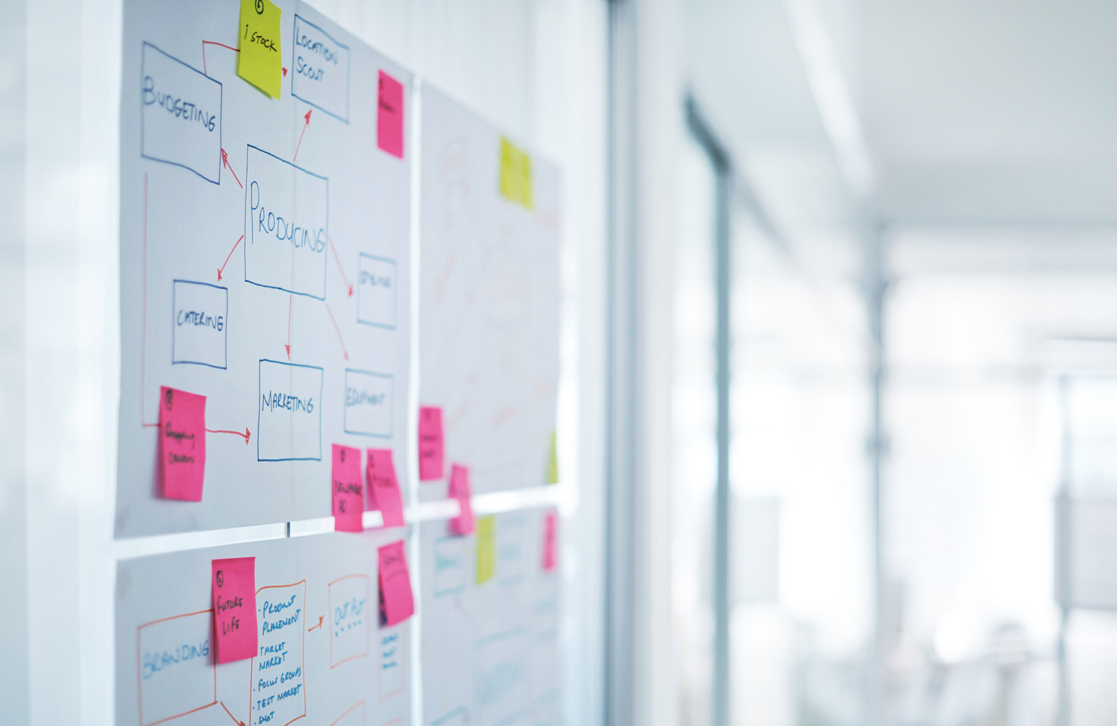
- Client workshops to map investigative methods, the physical and digital tools in use, business objectives and success measures.
- Brainstorming sessions with stakeholders and investigators to generate options and align on goals.
- User interviews to surface real needs and pain points, not assumed ones.
- Competitive research to understand what the category already solves — and what it leaves open.
- Reframing the challenge around what the research actually showed.
03
Ideation
- Defined the layout and information architecture around investigators' needs and motivations.
- Drafted multiple user flows: the optimal path, error states and the awkward edge cases.
- Built paper prototypes and tested them with investigators to validate concepts cheaply.
- Reused the bank's existing design system so design and engineering effort went into the hard parts.
04
Design
- Wireframes and a full sitemap to establish the structure and flow of the tool.
- Validation sessions with stakeholders, focused on usability and time saved per investigation.
- Iterative refinement of wireframes and sitemap as feedback came in.
- Close collaboration with developers and data analysts to fit the design to the underlying data model and technical constraints.
- A high-fidelity clickable prototype to define navigation, page interactions and component behaviour.
05
Design decisions & screens
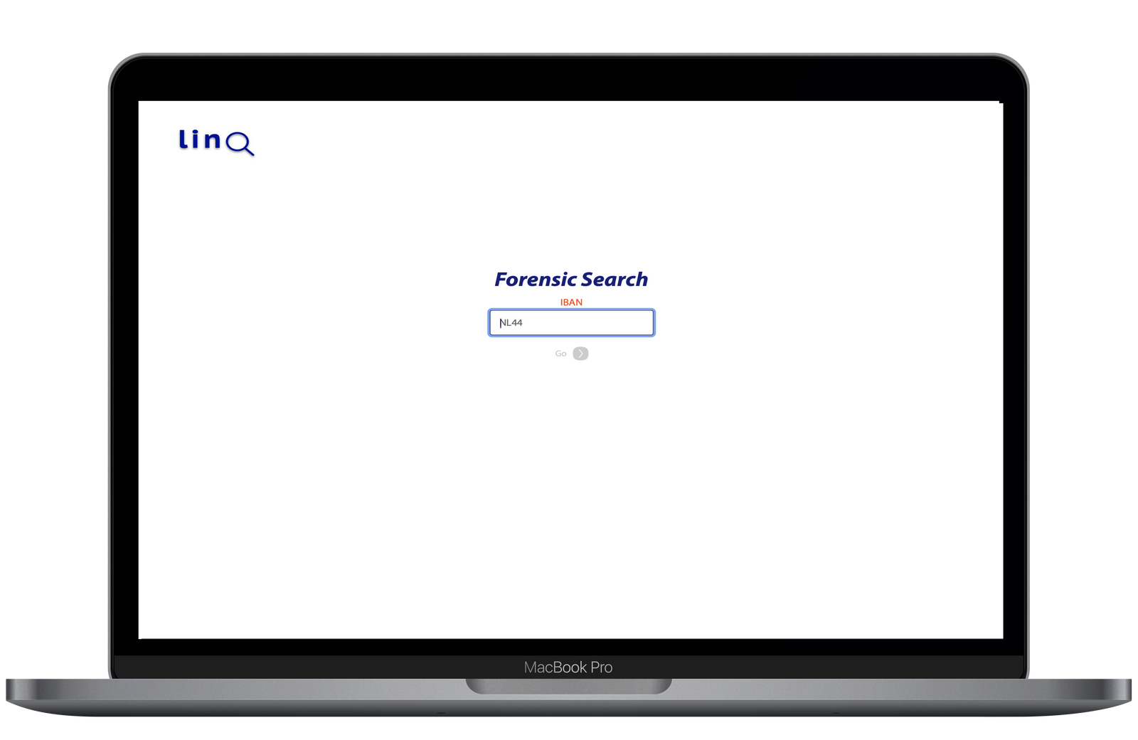
Search that fits how each investigator works
The search function was originally scoped to start an investigation from one data type — an assumption held by the developers and business analysts. Interviews showed every investigator has their own entry point into a case. For the tool to be adopted at all, search had to support all of them.
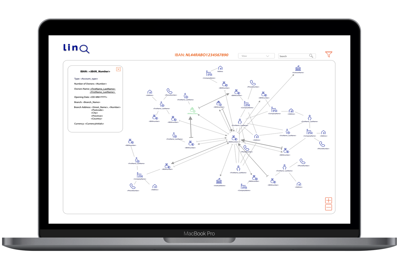
Interactive node exploration
Selecting an icon opens the full data node in a slide-in panel on the left, and the network shifts right so it stays fully visible — a detail that came straight out of user interviews. The selected node changes colour to keep it findable, and zoom controls move between first, second and third degree relationships, giving investigators control over how deep the network goes.
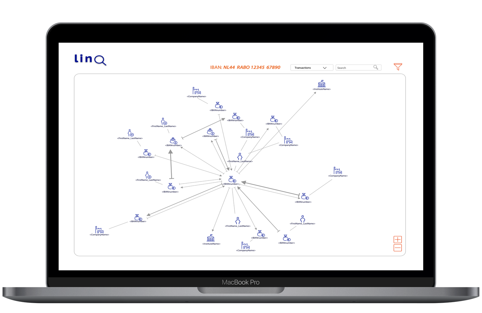
Network visualisation
The tool represents complex information systems and social networks visually. Arrows carry direction to show which way a relationship runs, each edge type has its own icon so structure reads at a glance, and arrow thickness reflects the volume or strength of a relationship. Clicking any arrow reveals more detail and lets investigators add further layers to the network.
Relationship dynamics in context
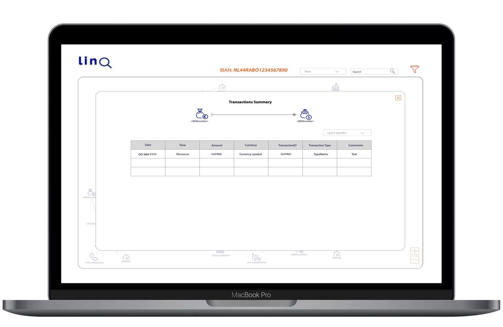
Clicking a relation opens a popup with detail specific to that connection. Interviews revealed the split: edges are the focus of an investigation, but investigators spend most of their time inside relations. Looking at an edge they want the big picture; looking at a relation they want to concentrate on that one thing. So the displayed fields are customisable, and the popup includes a small visualisation of the relation itself to keep context.
06
Outcome
- A clean, intuitive, interactive tool that went beyond what stakeholders and investigators expected.
- Investigation time reduced by roughly 30%, with a sharp drop in physical paper and pen use.
- A streamlined interface and robust visualisation made it easier to uncover fraud and revisit past investigations.
- High adoption, because the tool accommodated a wide range of working styles rather than enforcing one.
07
Learnings
- Deepened my practice in data visualisation — translating dense, relational data into something investigators can act on.
- Continuous user engagement through design and development is what keeps a product honest to diverse needs.
- User-centred design plus thorough validation measurably improves adoption of a new digital tool.
08
Feedback
"In this data-science focused project Miriam succeeded in translating complicated requests into simple designs. She created a detailed user map and creative solutions to facilitate different user requirements. Her very good communication style leads to trust with both team members and investigators, and enables us to move fast."
"The investigation tool looks very nice — Michael and I think it would make our job much faster and easier!"
More of the work
Back to selected work